MasterThiefShowdown
Devlog. 7: First week of production sprint 2
Introduction:
Hello everyone to what is the first week of the last full production sprint, by the end of this sprint we'll hopefully have a fully finished product which we can then make the final improvements and adjustments on in the final two weeks before the deadline. Right now, the focus will then be to finish all the most important features within the game and settle on the best finished version of the game. Let's go over the big progresses that we have made in this week.
Going away from last weeks meeting we've gotten very valuable feedback on our current state of the game. Sadly, not all feedback was praise, one of the main problems that we have is we just don't have a finished gameplay version. The item's don't spawn in, there's only one guard with a very limited patrol. In short, there is no real 'game' for them to properly give feedback on the gameloop and on the fun value of the game. Aspecially the layer feedback was very limited, the information within the game isn't communicated very well to the player so a hypothetical player would not really know what to do within our game.
So that was our main focus this week, creating a finished gameplay testing iteration and make a lot of additions to the player feedback to make the game less confusing to player's who haven't spent two hours reading a hundred paged design document. Which you know, you'd think it was pretty obvious but hey, hindsight is twenty-twenty.
Art Section:
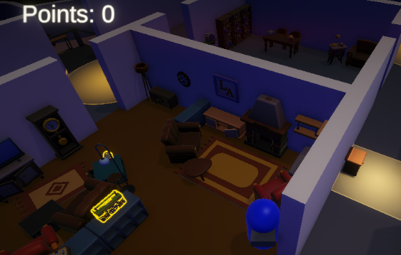
Another common feedback that we have gotten and that our artists took to heart was our way of thinking when it comes to decorating the level. Right now, the way we were developing it was by going room by room and implementing it fully, however as you might now hear for it yourself; this wasn't a very effective way of working. A tip that we have gotten was to instead of going at it one room at the time, we went by one detail iteration at a time, for the entire level. So I can now, with pride, say that we have a fully decorated level!
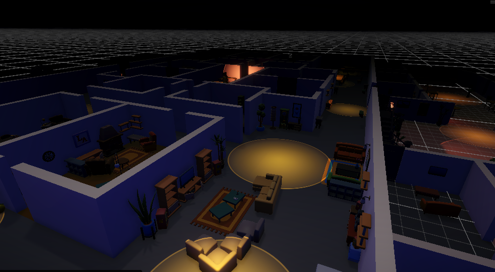
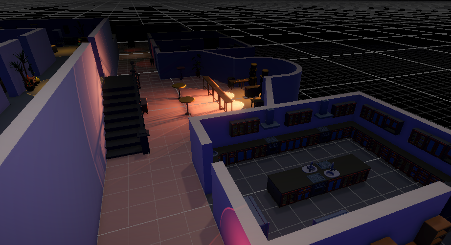
And earlier than we expected, this is the first detail pass of the level whereby its mostly filled with large meshes. Both Tommy and Matteo have been working hard together to finally get to this state of our level. This should also now help to define more how the level will be traversed by both the player and guards. As well as where we can start placing the valuables for the player to collect.
The second pass, which we hope will be completed by next week, will be adding the medium meshes within it like some of the smaller tables and wardrobes. And hopefully by the third week, we'll have every room looking like the fabled 'Cigar room' which once you play the game will be very obvious what room I'm talking about.
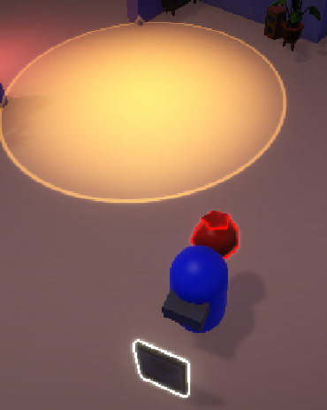
Along with this, Matteo also busied himself making some of the long-awaited models within the game, specifically for the guard and players. Letting us soon, finally move away from the Unity base capsule, no matter how much we like them. The player model is still in development as we speak however the guard model is fully finished. Here he is below, doesn't he look like something straight out of the Jetsons?
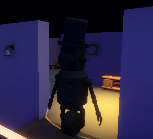
We've decided to move away a bit from having humans, mostly because we wanted to inovate a bit more and make something really special and distinctive (not because this is a perfect excuse to limit a bit on complex animations, not at all). I still have no clue what Tommy is cooking up for the player model, however I head it will be something 'roomba-esque' which I'm personally very hyped for.
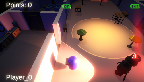
Finally, our Matteo busied himself working on the player feedback by handling the main issue within the level right now. It is difficult to tell what is what. What is a trap, what is a valuable, etc. One of the solutions that was advised to us was by adding an outline shader on the meshes of the game objects. Making them pop out more within the level and making it super obvious what precisely is important and worth a second or third glance. What? You don't like this, well be happy that we didn't bring out the Uncharted yellow paint bucket. I know how much everyone complained about that a year ago.
Below you'll find an example image of how these outlines now look within the level, the colour for them can be subject to change. Personally, I'm thinking of making the valuables more of a bright yellow colour but we'll see about it. For now, it'll be white for the valuables and red for the traps.
Thanks to all these new visuals, we're hoping that this will improve the level a lot more, as well as your own player experience. And finally, getting rid of some of the confusions you might have faced with some of the previous builds of the game. So be sure to try this build of the game, I'm sure the improvements will look like night and day.
You might be asking, where are those materials you promised us last week. They're not here yet, maybe next week...anyways.
Programming Section:
Us programmers have also been hard at week, implementing all the feedback that we have gotten from last week. We really had a simple goal; make a playable game which if you are programmer yourself, you can understand how absolutely helpful that was to motivate us into creating an iteration which meets at least the minimum of this requirement. And well, for me I think we managed to safely reach that goal. Now, I just hope that the course moderators will be of the same opinion. God, I really hope so.
Cristian took it immediately upon himself to implement both the spawning system for the trap pick ups and the valuables, you might think this sounds easy but believe me, there were a lot of additional details for him to worry about. Such as how spawning will need to be handled within separate rooms and to apply a selection. Thankfully, he went above and beyond, and made a very robust system so that Matteo could have an easy time adding the specific valuables he wanted to spawn within specific rooms.
We also busied making the pop-up button icons, which should give the player easy understanding of what the controls do and when they have to be pressed. Letting you escape from any of the previous confusions you might have had with them, such as how maybe most of you have encountered; how in gods name do I deposit something at the doors? This system, however, is still in production but should definitely be finished somewhere in the coming days. Raphael, as well, worked hard at finishing the sound system for the guards to finally meet the standard that he had set for himself. Welp, I'm not Raphael, but I'm pretty sure it now meets that standard. So good job!
Finally, I had a few important tasks dropped on my lap, it seems that without my input I have become the resident UI expert. Believe me, it was not by my design, it just seems that out of all the programmers within my group I'm the only one with any prior experience (I made like a start menu and game over menu once, and suddenly I'm an expert?!). So I was tasked with adding some of the UI icons that get displayed to give extra information to the player. For instance when a guard is close, when the player is getting actively chased by one, and where precisely the deposit points are at the maps. I implemented these with your standard directional icons as well as a threat vignette system. Be sure to try it out and tell me whether its too crowded?
And that was about that for this week, as you can see, we made a lot of important progress on our project which we'll be developing and refining on in the near future. We're hoping that with this current build, we'll get an excellent idea of what still requires further developing and what we can throw away to focus on more important matters.
Once again, be sure to have a try of the build, preferably with friends, and tell us what needs to improved upon and where more work is required. Any little feedback, as you can see, helps us to bring this project to a good end and a very polished shine.
Until next week!
Leave a comment
Log in with itch.io to leave a comment.